Remedy
Remedy is a melodic rock/metal band from Stockholm, Sweden, channeling the fire of classic ’80s rock through a modern, cinematic lens.
Deliverables
Strategy, Identity, Visual Direction, EPK Platform, Narrative & Content
Location
Stockholm, Sweden
Strategic Clarity
Our work with Remedy began by defining far more than a visual style or promotional direction. Phase 1 was rooted in establishing the deeper principles that would govern how the band should be understood, felt, and communicated across every touchpoint.
To build a complete and unmistakable world around Remedy that translates the force, discipline, and emotional weight of their music into a clear industry-facing identity.
PHASE 1 INCLUDED:
Clear market positioning
Core message and narrative direction
Audience alignment
Competitive differentiation
Long-term creative roadmap
This process gave Remedy a far stronger sense of internal coherence. It clarified not only how the band should look, but what they stand for, how they should feel in the mind of the audience, and what must remain constant as the project expands. The aim was to move beyond genre familiarity and build a world with genuine authority, precision, and emotional weight.

Brand Systems
From this clarity, we built a complete identity system designed to govern Remedy’s public expression with consistency and force.
KEY ELEMENTS INCLUDED:
Messaging hierarchy
Core principles of narrative structures
Emotional vocabulary and identity logic
Symbolic motifs
Consistency guidelines
This gave Remedy a brand system that feels disciplined, cinematic, and recognisable. Not a collection of rock aesthetics, but a structured identity capable of guiding visuals, communication, presentation, and future expansion with total coherence.

Visual Systems
The visual world became one of the most important and defining parts of the entire project. A central expression of the band’s identity.
We developed a complete visual language around Remedy that translated the music into atmosphere, form, and image. This included redefining the band’s look through new apparel, directing the use of black suits as modern armour, and building a visual world around cinematic restraint, ritual detail, and urban power. The aesthetic system included the relationship between human presence, artefacts, symbols, neon, leather, architecture, rain, and the charged energy of city environments.
KEY VISUAL ELEMENTS INCLUDED:
Redefining the band’s look through tailored black apparel and ceremonial uniform thinking
Photo and video shoot guidance for visual alignment
Creating AI-assisted imagery to expand and express the Remedy world
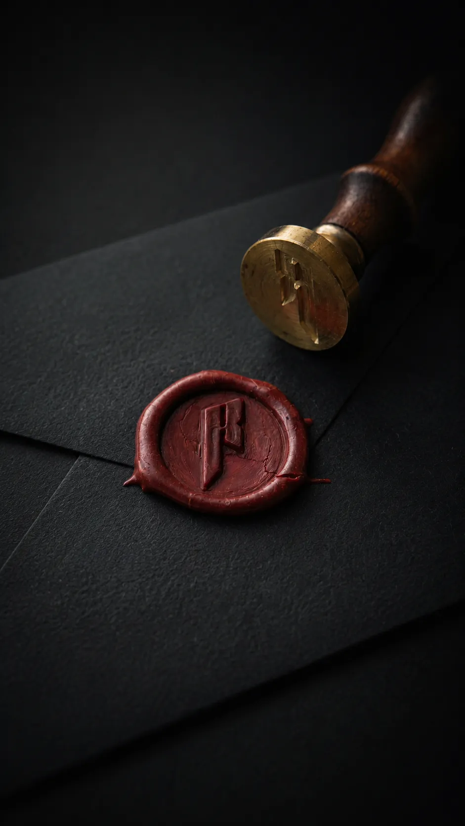
Developing the symbolic object language around sigils, calling cards, wax seals, neon manifestations, leather textures, and rain-soaked urban environments
Delivering an EPK platform designed not just to inform, but to immerse and persuade
This work gave Remedy a complete visual reality that feels modern, powerful, and fresh, while remaining fully aligned with the emotional tone of the music. It allowed the band to step into a world that feels authored, intentional, and industry-ready.

Narrative & Content
Alongside the visual system, we structured the storytelling and presentation of Remedy so that the band could be understood immediately by labels, industry partners, media, and new audiences.
This included building a cinematic one-page Electronic Press Kit experience, mixing live footage of the band, photographs, media player, artist biography and pitch language. This is part of developing a broader narrative architecture capable of expanding into press materials, media readiness, social platforms, and a growing digital presence.
We also translated the world into tangible first-contact experiences for industry outreach. This included specially designed calling cards as physical artefacts for record labels, along with a custom wax press used to seal envelopes containing the card that links directly to the EPK. These pieces extended the story beyond the screen and turned first contact into part of the Remedy experience itself. Staying true to the world of Remedy.
KEY CONTENT AND DELIVERY ELEMENTS INCLUDED:
Industry-facing EPK strategy and platform
Artist biography and pitch structures
Press and recognition presentations
Physical outreach system through calling cards and sealed packaging
Actionable Phase 2 rollout that brought the full identity into alignment across digital, visual, and physical channels
This ensured that Remedy’s story could live not only in music, words, and visuals but in experience, presentation, and tangible form.


The Outcome
The result is a complete branding system that began in strategic and narrative clarity, then moved into full visual realization and real-world deployment.
What we delivered for Remedy was not a surface-level rebrand or a promotional asset package. It was a deeply considered and highly executed project that built a new world around the band, brought that world into reality, and aligned every major element toward one clear purpose: to position Remedy as a serious, compelling, and signable act.
From the four foundational layers established in Phase 1, to the actionable rollout of Phase 2, the project brought together strategy, identity, design, story, apparel direction, photography and video guidance, AI image creation, a high-impact EPK, custom calling cards, and wax-sealed first-contact presentation.
It has been a substantial project, delivered with absolute focus, on time, and beyond expectation. The outcome is a band presence that feels sharper, deeper, and more complete.
A world that reflects Remedy’s music with real authority and gives industry professionals something immediate, memorable, and impossible to mistake for ordinary.
We look forward to continuing to work with Remedy as their path continues and their career evolves.


