High In The Arctic
A consciousness-led collective emerging from the Arctic Circle, exploring connection, creativity, and expanded perception through art and visual culture.
Deliverables
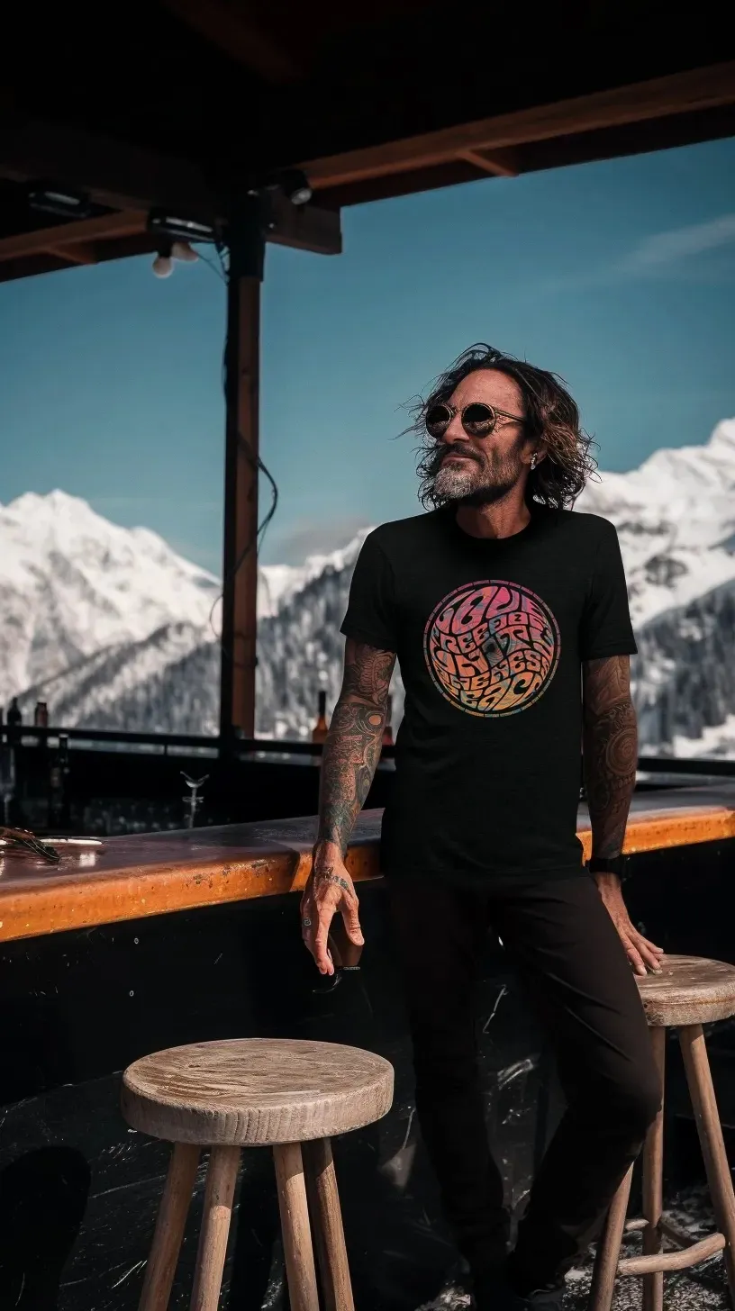
Visual Identity, Psychedelic Illustrations
Location
The Arctic Circle, Scandinavia
Strategic Clarity
High In The Arctic began as a project rooted in presence, creativity, and the quiet expansiveness of northern landscapes.
Our role was to translate these ideas into a visual direction that could communicate both place and inner experience, connecting the stillness of the Arctic environment with the introspective nature of altered perception.
TOGETHER WE DEFINED A CREATIVE FOUNDATION THAT REFLECTS:
Arctic landscapes as a source of clarity and perspective
Psychedelic influence expressed with restraint and subtlety
A visual language that invites curiosity, reflection, and exploration
This clarity allowed the identity to feel both atmospheric and intentional, rather than purely decorative.

Brand Systems
We developed a brand identity that balances expressive visuals with calm structure.
The system establishes a recognisable foundation for the project while leaving room for artistic interpretation and evolution.
KEY ELEMENTS:
Identity direction and narrative positioning
An atmosphere that encourages stillness, curiosity, and quiet expansion
A cohesive design language across artwork and communication
The goal was to ensure the project feels coherent and distinctive, while still retaining the openness associated with creative and consciousness-led spaces.


Visual Systems
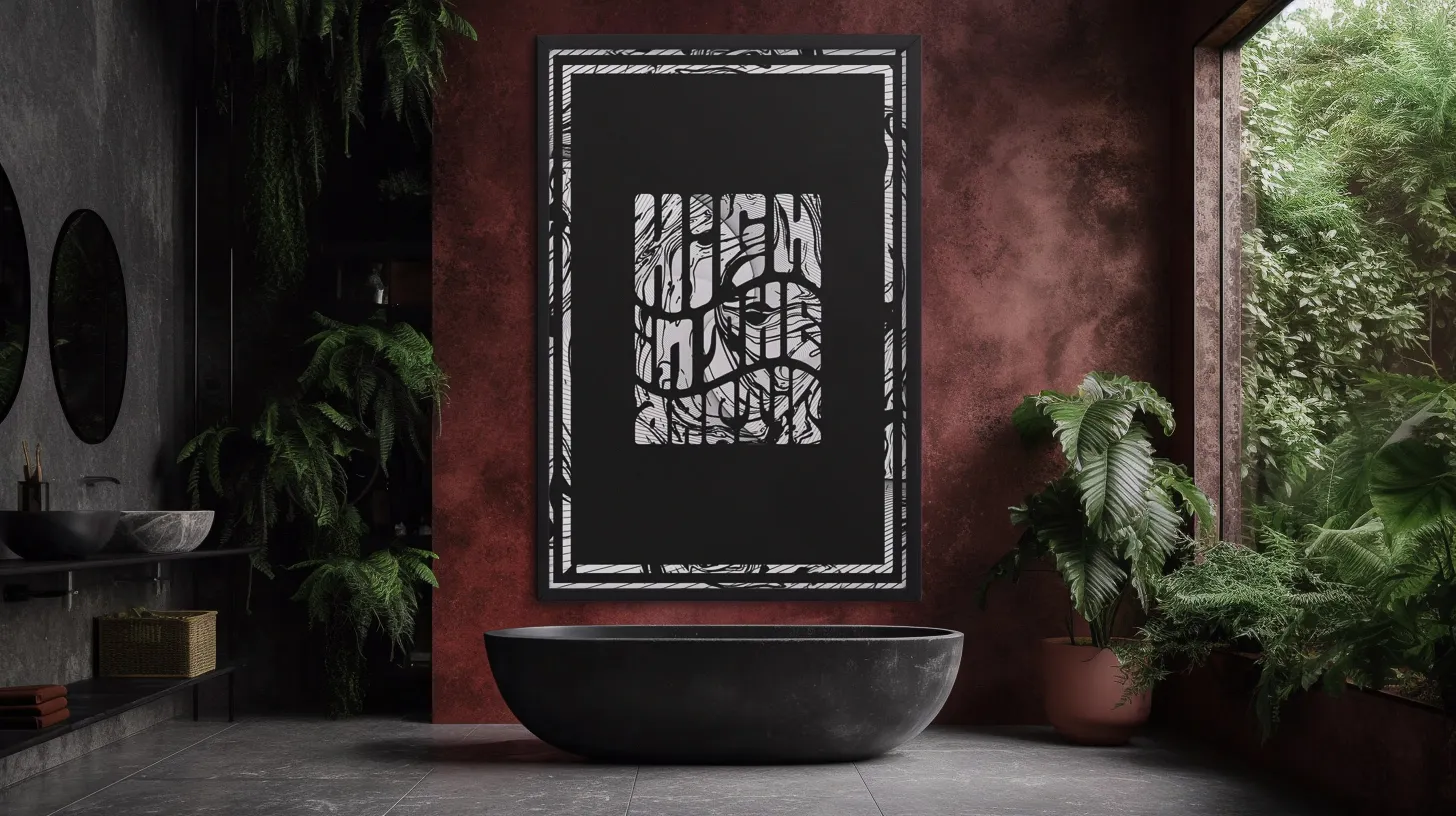
The visual identity draws deeply from Arctic environments and subconscious imagery.
Organic contours, layered structures, and atmospheric forms combine to create illustrations that feel immersive and introspective.
KEY ELEMENTS:
Psychedelic illustrations inspired by northern landscapes and inner terrain
Organic geometry and layered visual depth
Typography and colour foundations
Rather than overwhelming the viewer, the imagery invites them inward.

Narrative & Content
The storytelling behind High In The Arctic connects landscape, consciousness, and creative exploration.
Subtle references to the psychedelic movement of the late 1960s and early 1970s inform the aesthetic while remaining grounded in contemporary design.
Through structure, language, and visual tone, the project communicates a simple idea:
That environment of vastness and stillness can open space for reflection, creativity, and expanded awareness.

The Outcome
The result is a visual identity that captures both the quiet power of Arctic landscapes and the introspective nature of psychedelic exploration.
An expressive yet restrained visual world that reflects the spirit of the project while inviting viewers into a deeper sense of curiosity and presence.
We are proud to have helped shape the visual language for High In The Arctic and to collaborate on a project that explores creativity, consciousness, and place with such openness.