Visual Oasis
It Took 63 Revisions. And I Loved Every Minute.

By
Emanuel Lindqvist
2026.10.19
/
9 min
The making of Visual Oasis - What If I Tried?, and what a collaboration between human imagination and artificial intelligence actually looks like.
I dislike posting on social media. You know the feeling when you push two opposing magnets toward one another and there’s that fascinating repulsion?
It's not that I have nothing to share.
I'd just usually rather spend my time making things than telling everyone I've made them.
But give me a new creative tool, a slightly unreasonable idea and the chance to explore something I've never done before, and suddenly I have all the time in the world.
That's more or less how Visual Oasis - What If I Tried? came to life.
What began as an experiment in motion design became a 37.83-second film, produced in two formats, built through custom animation code, accompanied by an original soundtrack, and refined across 63 numbered revisions in six days.
And I had an extraordinary amount of fun making it.
There's a popular perception that creating something with AI involves writing a prompt, pressing a button and watching a finished masterpiece appear five minutes later.
But that is not what generally happens with these deeply creative processes.
This was a collaboration involving creative direction, visual research, programming, design, animation, music production, experimentation, critical judgment, a considerable number of mistakes, and the occasional conversation with a machine that had apparently forgotten everything I'd just asked it to do.
Here's how it actually happened.
First, I needed an idea
I didn't set out to make an advertisement about artificial intelligence.
I wanted to make a film that expressed what Visual Oasis is about.
We're a Vision Studio working at the intersection of strategy, storytelling, design and technology. We help businesses uncover what makes them valuable and turn that understanding into identities, messages and digital experiences that connect with people.
I wanted the film to communicate these interconnected disciplines without resorting to the usual promotional language.
No voiceover explaining our services. No generic corporate montage. No lengthy introduction telling people how creative we are.
Instead, I wanted the creativity to be visible in the work itself.
The film would move through six connected ideas:
INSPIRATION → STRATEGIC CLARITY → STORY → DESIGN → TECHNOLOGY → CONNECTION
Then Visual Oasis would appear, followed by our positioning:
A VISION STUDIO.
Every word would have its own visual behavior, but nothing should feel disconnected. One scene needed to transform into the next.
The motion itself would tell the story.
My original treatment was considerably more elaborate. There were explorations involving complex psychedelic environments, floating imagery and ambitious 3D ideas.
Eventually, I realized that the strongest direction was much simpler.
Typography. Geometry. Color. Rhythm. Motion. A few carefully chosen moments of expressive imagery.
The challenge was to make those elements feel extraordinary through their movement.

A library of inspiration, and a long list of things not to do
I began with approximately 125 curated inspiration images, alongside six motion-reference videos, nine reference stills, around 30 font files, four official logo files and footage from real Visual Oasis client projects.
I also created a detailed written production brief.
That brief covered the film's concept, visual identity, scene order, references, typography, animation principles and restrictions.
Some of the most important instructions described what I didn't want.
No generic futuristic environments.
No endless floating 3D objects.
No unnecessary visual effects.
No shiny, plastic-looking AI imagery.
No random spectacle masquerading as creative direction.
And no replacing the studio's actual identity with an AI approximation.
The palette was already established:
Turquoise: #00A99D
Orange: #F15A24
Golden yellow: #FBB03B
Sand: #FDEED1
Switzer was the primary typeface, and the official Visual Oasis logo files had to be used.
These restrictions weren't obstacles to creativity. They helped give the experimentation a consistent identity.
Something else became clear very early: reference material isn't self-explanatory.
A still image can show a composition, but it doesn't explain how an animation moves.
A video of a rotating object might demonstrate an interesting camera movement without suggesting that I want the object itself.
A typographic reference might be useful for its timing but completely wrong for our colors.
Working with AI meant repeatedly distinguishing between the aspects of a reference I wanted to explore and the aspects I wanted to leave behind.

The first 4.5 seconds. Then I stopped.
One of the best decisions was not to build the complete film immediately.
Instead, I asked Claude to create only the opening 4.5 seconds, render an actual playable preview, and stop for my creative approval.
No continuing to the next scene because the AI thought it knew where the project was going.
No assuming that a technically functioning animation was an approved one.
I reviewed the opening, refined my feedback and asked Claude to render it again. That cycle continued until it felt right.
Those first 4.5 seconds went through 14 numbered revisions.
More than a fifth of the project's entire revision history was spent establishing the opening.
The sequence begins with a rapid series of full-screen images from my inspiration collection.
The imagery changes in quick rhythmic succession before the camera pulls back to reveal an organized grid.
The images disappear, leaving INSPIRATION against a clean background.
It was a simple idea on paper.
Making it feel precise was another matter.
How quickly should the images change? How should the camera pull back? How much of the grid should be visible? How should the word arrive? When should it stop moving?
These questions couldn't be answered satisfactorily by a single prompt.
I had to see the animation, judge it and direct the adjustments.
Only when I was happy with the opening did I continue.
From inspiration to strategic clarity
Originally, the next scene was called STRATEGY.
But during development, I reconsidered the wording.
Strategy describes part of what we do. Strategic clarity describes more of what we want our work to achieve.
So the word changed.
That meant changing the animation as well.
The longer phrase needed a different composition and different timing.
Its visual world developed through turquoise particles, geometric structures and precisely organized movement.
Small elements formed larger systems. Order emerged from complexity.
That connection between language and animation was important throughout the project.
I wasn't simply asking AI to make words move.
I was trying to make their movement express something about their meaning.
Storytelling, expressed through motion
The STORY section introduced actual footage from our client work.
This distinction is worth emphasizing.
The videos weren't randomly generated examples inserted to make the film look impressive. They represented real Visual Oasis projects.
Their presentation, however, was designed as motion graphics.
The animation used tightly timed entrances, slats, splits, bands and other graphic reveals.
The four video moments arrive one second apart, at approximately 11.25, 12.25, 13.25 and 14.25 seconds.
Some effects were reworked because they felt too ordinary.
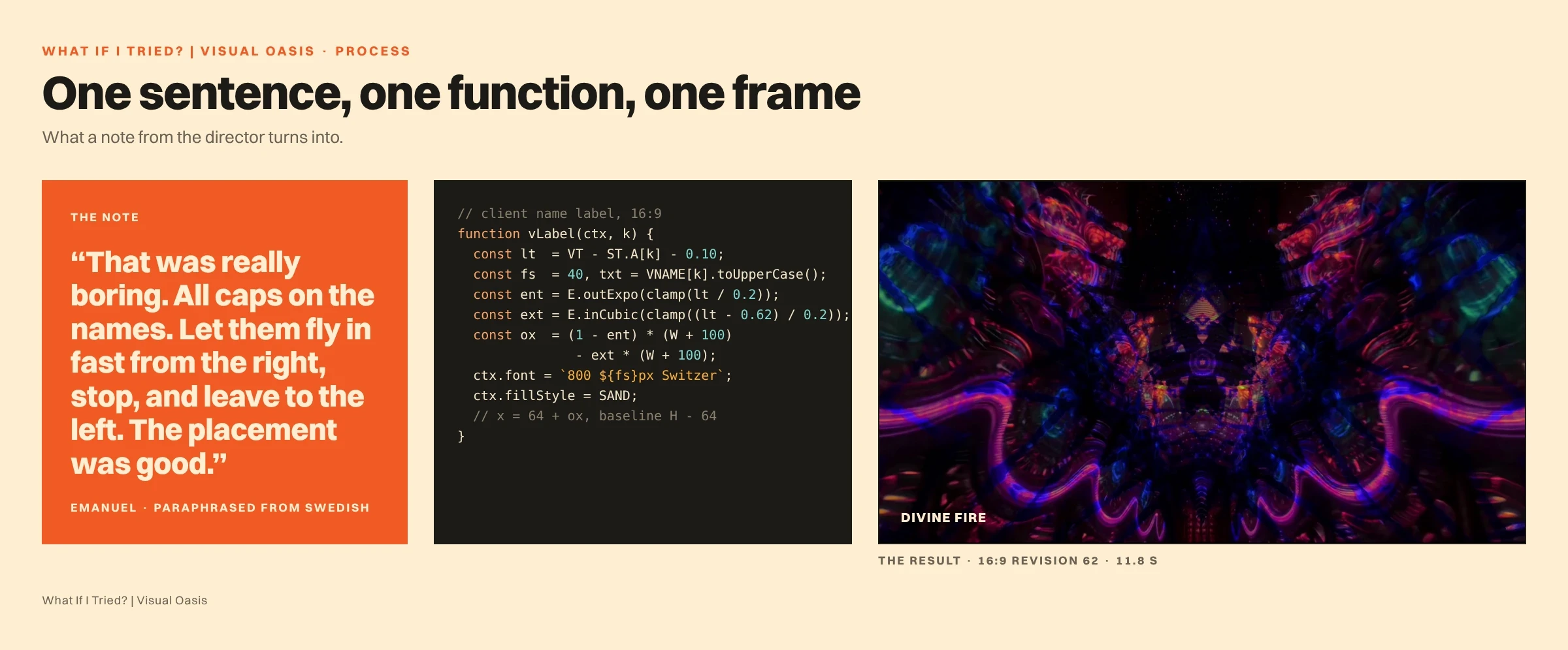
Later in production, client-name labels were added for DIVINE FIRE, SOUL JOURNEY and REMEDY.
The first version of those labels wasn't particularly interesting.
My feedback was straightforward: the placement was good, but the animation was boring.
So I asked Claude to rebuild the animation.
The final direction used uppercase Switzer lettering, arriving rapidly from the right.
It's a small example, but an important one.
AI can produce a working animation that is still aesthetically unconvincing.
Someone has to decide that it isn't good enough.
DESIGN: Where typography becomes an environment
DESIGN became one of the most kinetic parts of the film.
The word changes through different typographic treatments in rapid succession, eventually transforming into a tunnel constructed from repeated lettering.
The camera travels through that tunnel, surrounded by orange and sand-colored typography.
I wanted the movement to feel powerful and immersive while remaining consistent with the film's minimalist graphic identity.
The tunnel also created one of my more interesting transition problems.
What should happen when DESIGN becomes TECHNOLOGY?
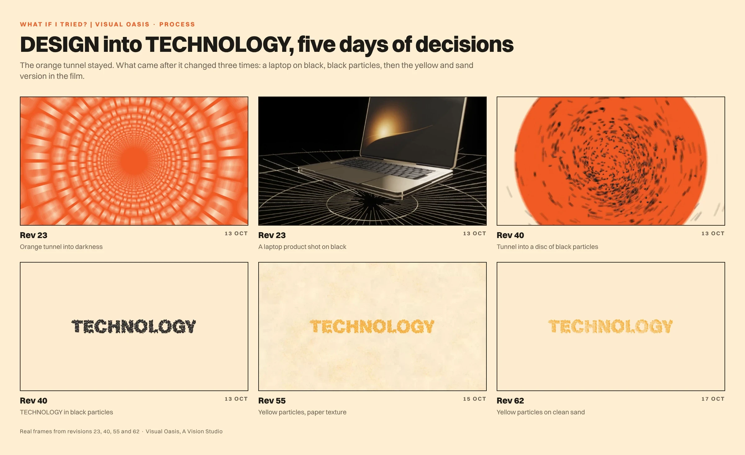
An earlier concept involved a highly detailed 3D MacBook, complete with separated components and a sophisticated product-style animation.
I explored the idea extensively.
But something about it felt wrong.
It was technically interesting, yet visually disconnected from the rest of the film.
More importantly, a computer wasn't necessarily the best way to represent technology within Visual Oasis.
For us, technology is less about the devices and more about what the tools make possible.
So I dropped the computer.
Instead, the DESIGN tunnel itself would become TECHNOLOGY.
The typography transforms while the camera continues moving. The tunnel changes character, its elements reorganize, and the animation develops into a geometric composition of spheres that ultimately form the word TECHNOLOGY.
This turned out to be a stronger approach because the transition became part of the storytelling.
Nothing needed to be introduced from outside.
The next idea was already contained within the previous one.
Of course, getting there required more revisions.
At one point, black typography against an orange tunnel felt too harsh.
I explored different combinations before moving toward a warmer treatment using sand and golden yellow.
The animation itself wasn't necessarily wrong.
The color relationship was.
Sometimes the solution to an elaborate technical problem is simply a better design decision.
CONNECTION: When the typography becomes human
CONNECTION was always intended to bring a human presence into the film.
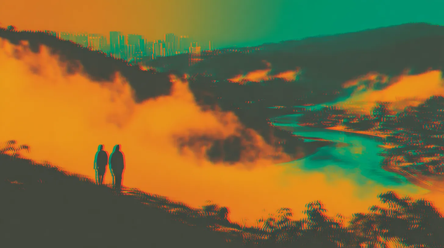
After a series of abstract structures, geometric systems and typographic transformations, I wanted a moment that felt more organic, emotional and slightly psychedelic.
I experimented with editorial photographic imagery and color-separated portraits.
One image featured a central figure surrounded by overlapping versions of herself, rendered in warm orange and turquoise.
That became the direction I wanted to develop.
I used Kling to explore turning the still image into moving footage.
The first attempts weren't right.
Some were jerky. Some distorted the subject. Others sent the colored echoes in the wrong direction.
I kept refining the movement, looking for something slower, smoother and more fluid.
Eventually, I achieved a version that worked.
Then I reversed it.
That one decision changed the visual meaning of the clip.
Instead of multiple figures merging into one, the colored versions now expand outward from the central person.
It felt more appropriate for CONNECTION.
But simply cutting to the video wasn't enough.
I wanted the human figure to emerge from the graphic animation itself.
So the word CONNECTION, raised subtly from the sand-colored background as three-dimensional typography, begins to break apart.
Its geometry transforms into fragments and horizontal slices.
Inside those fragments, the video is already moving.
Little by little, the audience sees parts of the face, hair and psychedelic color echoes.
The fragments assemble into a complete moving image, which continues uninterrupted.
The goal was for the viewer to experience one continuous transformation:
Typography becomes geometry. Geometry becomes imagery. Imagery becomes human.
That moment captures much of what I wanted the whole film to express.

Giving digital surfaces an analog character
As the animation developed, I noticed another issue.
The solid colors were clean and consistent, but some surfaces felt almost too clean.
There was a risk of the film looking sterile, like a sequence of perfectly rendered digital shapes.
I wanted a little more character.
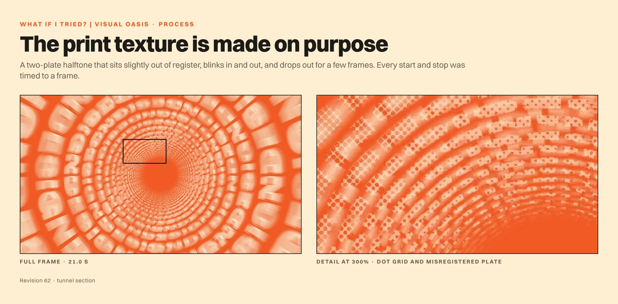
I began experimenting with subtle analog textures, inspired by grain, printing imperfections and slightly irregular pigment.
The intention wasn't to create heavy grunge or make the film appear old.
It was to introduce just enough imperfection to make the graphic surfaces feel tactile.
I compared visual tests to establish the right direction, then asked Claude to refine the implementation.
The texture needed to work across backgrounds, typography, spheres and other geometric elements.
It also needed to behave consistently during movement.
A texture on a rotating sphere should feel attached to the sphere, not like a filter floating over the screen.
Likewise, the surface treatment should interact with the lighting on three-dimensional lettering.
Claude implemented a procedural print-inspired treatment, including grain and a two-plate halftone effect with slight misregistration.
It was applied selectively.
Some sequences benefited from stronger texture. Others needed to remain cleaner.
Several revisions focused on exactly when the texture should appear and disappear.
In one case, the treatment remained visible after it should have ended.
That wasn't solved with a new creative prompt. It required a precise timing correction in the animation code.
Claude adjusted the effect window to end on the correct frame.
These are the kinds of details audiences rarely notice consciously.
But they contribute to whether the finished film feels considered.
The surprising part: Most of the animation was code
The film was not created by asking a video-generation model to produce 38 seconds of finished animation.
Its main motion-graphics sequences were programmed.
Claude built a custom animation and rendering system using JavaScript and HTML Canvas.
The production code was approximately 1,040 lines per aspect ratio.
The system calculated the composition at each point in time, rendered individual frames and assembled them into the final video.
Typography was converted into vector paths so letters could be separated, stretched, transformed and reconstructed.
The sense of three-dimensional space came from custom camera and projection calculations rather than a conventional 3D engine.
Even the motion blur was controlled through multiple samples within each frame, with different settings for fast-moving and static moments.
The project also used deterministic rendering.
In practical terms, asking the renderer for a particular moment in time produced the same result each time.
Even procedural texture and certain glitch effects were controlled through repeatable settings.
That was essential.
If I approved a transition, I didn't want it to change unpredictably every time another section was modified.
This was one of the major advantages of building the animation through code.
AI helped write the system, but the finished animation remained editable, reproducible and precise.
Changing a color didn't require regenerating the entire visual concept.
Adjusting a word's timing didn't risk turning it into something completely different.
That level of control became increasingly valuable as the project grew.
Then came the music
Here's something people might reasonably assume about the film:
That I found a piece of music first and animated everything to it.
I didn't.
The film came first. The soundtrack was created afterward to fit the animation.
I knew the important moments, the transitions, the changes in visual energy and the approximate timing.
Then I needed music that would make those moments feel even stronger.
And finding it became a creative project of its own.
I experimented with several approaches.
Claude explored programmed sound effects, timing cues and synthesized musical sketches.
I also tested AI music generation services, including ElevenLabs.
Some of those tools could analyze the video and generate a soundtrack based on its visual qualities.
The results were interesting, but they weren't quite what I wanted.
Some sounded too generic.
Others were too light, too cheerful or too pop-oriented.
There were plenty of bright electronic melodies, but not enough depth, character or bass.
I wanted something more mysterious.
Deeper.
Funkier.
A little psychedelic.
Something with movement and personality, rather than a conventional commercial soundtrack.
I explored references in experimental psychedelic bass music, looking for elastic low frequencies, unusual textures, organic rhythms and unexpected sonic details.
Eventually, I began working more extensively with Suno.
But even then, the soundtrack didn't emerge from one successful prompt.
Eighteen tracks. One final soundtrack.
I used Suno to generate approximately 18 different tracks.
Each had something interesting.
One might have a great opening.
Another had a bassline that felt right.
A third had a more satisfying rhythmic change.
Another contained an atmospheric section that worked beautifully with CONNECTION.
But none was necessarily the complete answer.
So I treated the generated tracks as source material.
I listened, compared, selected and edited.
The strongest sections were cut together and arranged to fit the film's timing.
I adjusted the structure around the existing visual transitions, rather than forcing the film to follow a generic musical arrangement.
Then I exported the edited composition and brought it back into Suno for further refinement.
The result was developed through multiple rounds of listening, editing and regeneration.
This wasn't a case of AI composing something and me simply accepting it.
AI generated musical possibilities. I selected, edited and arranged those possibilities into a soundtrack.
That process also revealed a recurring difficulty with AI music tools.
Asking them to improve one part of a track could unexpectedly change everything else.
I sometimes had sections that worked perfectly, only for a new generation to alter the rhythm, remove the bass or destroy a carefully timed transition.
It became important to preserve what already worked.

Building around the film's actual rhythm
The opening sequence involved rapid image changes, so the musical accents needed to support that rhythm.
Around 16 seconds, the DESIGN section called for a distinct musical impact, followed by a groove that could carry the rapidly changing typography.
Between those major moments, I wanted variation, not an endless buildup.
The music needed to evolve through changes in bass, rhythm, texture and energy.
At approximately 25 seconds, CONNECTION introduced another important transition.
Then, as the psychedelic human footage unfolded, I wanted a softer and more spacious musical atmosphere.
I explored a halftime feeling, where the underlying pulse could remain around 110 BPM while the rhythm began to feel closer to 55 BPM.
This offered a way to slow the emotional pace without creating an abrupt musical break.
Finally, the Visual Oasis logo and A VISION STUDIO needed space.
Not another enormous musical climax.
Just a considered ending that allowed the identity to register.
The finished soundtrack was the result of finding and constructing those relationships.
And like the visuals, it became stronger through experimentation rather than through accepting the first usable result.
Two formats, one film
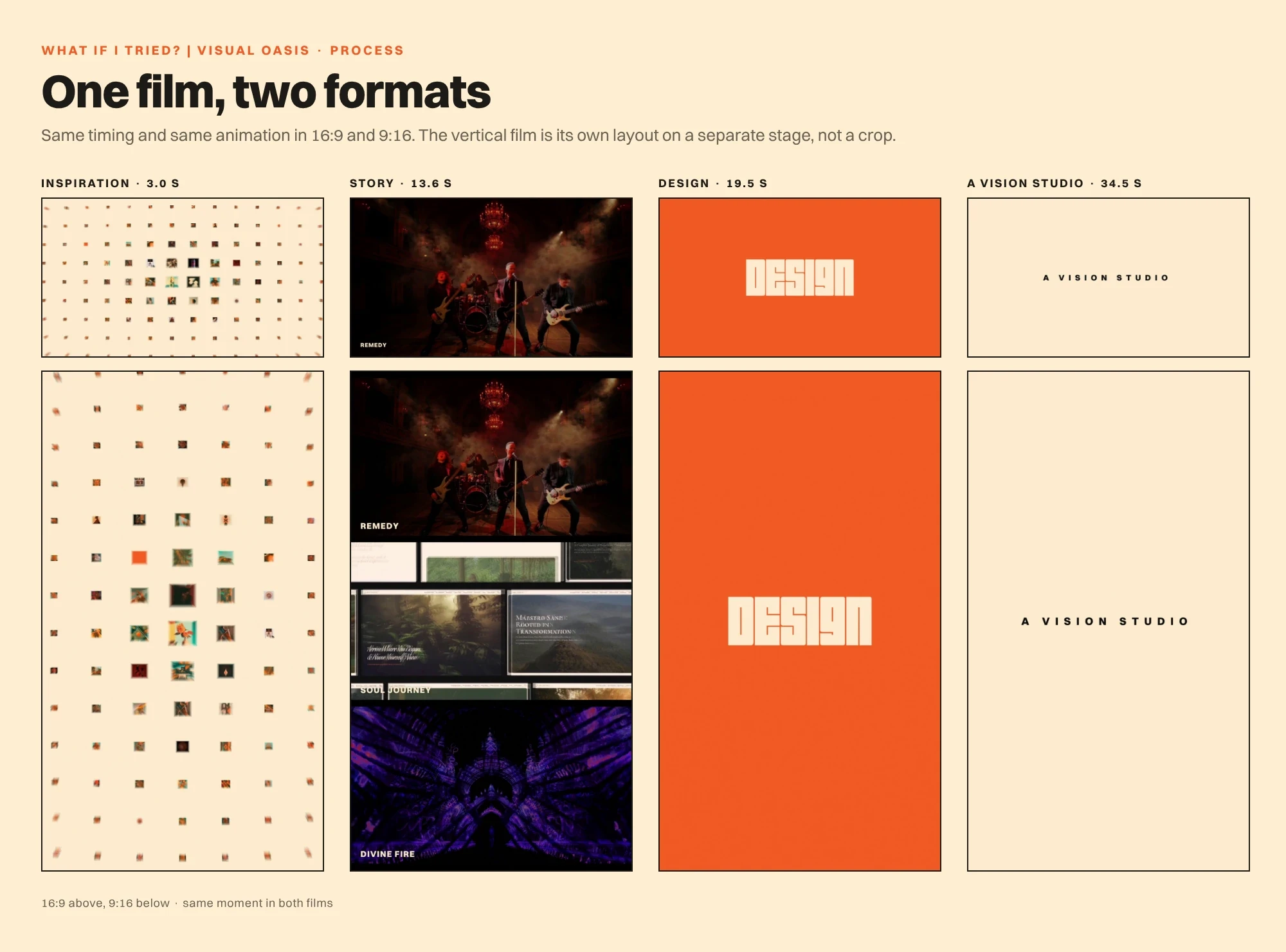
I created the film in both widescreen and vertical formats.
The horizontal version is 1920 × 1080.
The vertical version is 1080 × 1920.
Both use the same underlying timing and soundtrack.
But the vertical version wasn't simply cropped from the horizontal one.
That would have compromised too many compositions.
Instead, Claude created a separate portrait rendering configuration.
The opening image grid was rearranged to fill the taller frame.
Typography and geometric animation were adapted to the portrait composition.
The CONNECTION footage was reframed.
The STORY section received a different layout.
In the vertical version, the first three client videos appear as smaller horizontal frames arranged vertically, before the fourth takes over the full screen.
The transition effects were adapted to those individual positions.
Even the printed texture and graphic details required scaling adjustments.
The objective was to preserve the identity and rhythm of the film while allowing each aspect ratio to work as a deliberate composition.
So although there are two final video files, there is only one creative work.
Each format is its own presentation of that work.

Sixty-three revisions in six days
The documented production period ran from 11 to 17 October 2026, across six working days.
The first 14 revisions concentrated on the opening.
Subsequent milestones expanded the film scene by scene.
The middle of the production was especially intense.
On 13 October, the project moved through 19 numbered revisions in approximately 24 hours.
The following day involved extensive music experimentation and soundtrack development.
Later revisions concentrated on finishing, 60 fps rendering, the portrait format, texture corrections and client-name labels.
By revision 63, the film had reached its final approved state.
But it's worth explaining what a revision actually meant.
It wasn't necessarily a complete rebuild.
It might involve adjusting a transition by a fraction of a second.
Changing a color.
Correcting a mask.
Refining a typographic entrance.
Removing a texture effect from a particular moment.
Changing how the vertical version handled a scene.
Or replacing one duplicated image in a grid containing more than a hundred.
These are small decisions in isolation.
Together, they determine the quality of the finished work.
The production loop
Most revisions followed a consistent process.
First, I watched the current render and decided what needed improving.
The feedback was often expressed in ordinary creative language rather than technical instructions.
A movement felt too slow.
A transition lacked impact.
A sequence was visually cluttered.
A particular color didn't work.
An effect continued for too long.
Claude then translated that feedback into changes to the relevant code.
Before rendering the complete film, it generated selected still frames and contact sheets to check whether the intended changes appeared correctly.
Once those checks passed, the full sequence was rendered and encoded.
I watched the result.
Then I decided whether it worked.
If not, I did it again.
The important part of this workflow was the separation of responsibilities.
AI could execute complicated technical changes with extraordinary speed and precision.
I was responsible for determining whether those changes actually improved the film.

Rendering wasn't instant either
The final animation was rendered at 60 frames per second.
With a running time of 37.83 seconds, each format required approximately 2,270 individually generated frames.
Across the two formats, that meant roughly 4,540 rendered frames.
Claude's production report describes a custom workflow using headless Chromium to render individual lossless PNG images before assembling them into video through FFmpeg.
The rendering system could run several processes in parallel.
Even so, a complete render on the available machine took approximately 40 minutes per version.
That made quick visual checks particularly important.
There was no point waiting through a complete render only to discover that a simple transition was broken.
The production also required practical engineering.
Interrupted renders needed to resume rather than restart.
Large video files needed to be encoded efficiently.
The final high-quality masters exceeded the available file-transfer limit, so they were divided into parts, transferred and reassembled.
The results were then checked for file size and duration.
These aren't particularly glamorous details.
But they are part of what it takes to turn a creative experiment into a reliable deliverable.
What went wrong?
Plenty.
One texture effect continued into a section where it wasn't supposed to appear.
A test render used the wrong frame-rate setting.
An early client-name animation was rejected because it lacked energy.
A duplicate inspiration image appeared in the opening grid.
A large master file couldn't be transferred in one piece.
Some rendering jobs were interrupted before completion.
Some creative ideas looked promising as descriptions but felt wrong once animated.
And there were instances when the AI misunderstood the purpose of a reference or made assumptions that turned out to be incorrect.
None of this is unusual in creative production.
What's different is the way these problems were solved.
Sometimes the solution was a better prompt.
Sometimes it was a different creative decision.
Sometimes it was a precise code change.
Sometimes it required an entirely new approach.
And sometimes it meant abandoning an idea I'd already spent time developing.
Perhaps the most valuable lesson was that AI collaboration works better when mistakes are visible.
Claude could inspect individual frames, analyze code, check rendered outputs and report what it had verified.
But it couldn't independently experience the complete film in the same way I did.
My eyes and ears remained the final quality-control system.
That limitation made human review essential, not optional.
The project also had to survive its own complexity
As the production grew, the amount of information became substantial.
There were many decisions, multiple versions, technical details, rejected concepts and approved treatments.
The working conversations sometimes exceeded the available context.
To preserve continuity, the project relied on written instructions, saved code snapshots, numbered revision folders and handover summaries.
Forty animation-code snapshots were retained.
Every revision had its own place in the production archive.
This allowed me to return to earlier states and protect previously approved work.
In other words, even with AI, good production management still mattered.
Perhaps more than ever.
So, who actually made the film?
It's tempting to frame the question as a competition between the human and the machine.
But that doesn't describe the experience particularly well.
I developed the concept, set the creative direction, assembled the references and client footage, made the creative decisions and approved each stage. Visual Oasis provided the established brand identity and the body of client work the film draws on.
Claude translated creative instructions into functioning animation code, developed the rendering workflow, implemented transitions and handled many of the technical tasks required to produce and revise the film.
Generative image and video tools helped create and animate selected visual material.
Music-generation tools provided raw musical possibilities.
Suno became part of a longer process of selecting, editing, arranging and refining the soundtrack.
These contributions were different, but interconnected.
And the relationship wasn't one-directional.
Sometimes the AI suggested an approach worth exploring.
Sometimes it produced something unexpected that inspired a better idea.
Sometimes it completely misunderstood what I wanted.
Sometimes it needed to be corrected repeatedly.
That interaction became the process.
The point wasn't to remove human involvement.
It was to see how much further I could explore my ideas with these tools available.
But isn't AI-generated content just slop?
There is a legitimate conversation to be had about the rapid spread of low-effort AI content.
There are also important questions about the treatment of artists, creative ownership, training data and the effect of automation on professional work.
Those concerns shouldn't be dismissed.
And I'm not suggesting that using AI automatically makes something creative, original or worthwhile.
It doesn't.
But the opposite assumption is also too simplistic.
The involvement of AI doesn't tell you everything about how a work was made.
It doesn't tell you how many decisions went into it.
How many alternatives were rejected.
How much experimentation happened.
How much skill was required to assemble and refine the result.
Or whether the people making it actually cared about what they were creating.
There's a difference between accepting whatever comes out of a generator and using generative tools as part of a larger, directed creative process.
That difference is worth talking about.
Not because spending more time automatically makes something better.
And not because 63 revisions should somehow be treated as proof of artistic value.
But because the widespread idea that AI-assisted work is always effortless simply doesn't describe the full range of ways people are using these technologies.
In this project, AI didn't eliminate the creative process.
It became part of it.
What I learned
Creative direction becomes more important when possibilities multiply.
AI can produce an enormous number of alternatives. That makes the ability to recognize what works, and what doesn't, especially valuable.
Constraints make experimentation stronger.
Our colors, typography, brand character and design principles provided a foundation that helped hold the film together.
The first result is rarely the most interesting one.
Some of the strongest moments emerged only after an initial idea was rejected or transformed.
The best workflow combines different tools.
Code was better suited to precise repeatable animation. Generative video was useful for selected moving imagery. Suno helped explore musical possibilities. Editing and critical judgment connected those elements.
Human review cannot be skipped.
Technical correctness isn't the same as creative success.
The process needs structure.
Written briefs, approval stages, version history and reproducible rendering made a complex collaboration manageable.
And curiosity is a perfectly good reason to make something.
That last point might be the most important.
Would I do it again?
Absolutely.
I learned an enormous amount during this project.
About animation.
About programming.
About AI tools and their limitations.
About music.
About how much precision is required to make a seemingly simple visual transition feel right.
And about how exciting it can be when creative ideas become things you can actually test.
The process wasn't always efficient.
There were dead ends, failed experiments, unnecessary detours and moments when the technology seemed determined to misunderstand me.
But I enjoyed it.
All of it.
Well, perhaps not every single render.
What began as a little experiment became something far more interesting, not simply because of the finished film, but because of the process that produced it.
And while the tools will undoubtedly keep changing, that curiosity is something I intend to keep.
I didn't use AI to avoid the creative process. I used it to explore more of it.
Visual Oasis. A Vision Studio.